Balance Design System - WeightWatchers
Balance Design System - WeightWatchers
Design System Implementation
In 2013, the WeightWatchers (WW) app was designed as a companion for in-person workshops, primarily serving as a tool for members to track their food and points. However, when workshops transitioned to a virtual format due to the pandemic, the WW app became the central platform for the program. This shift led to a rapid influx of new features, which, combined with a lack of cohesive design and architectural planning, resulted in an overwhelming and confusing user experience. We built a comprehensive design system to address this which launched globally in February 2024. This initiative resulted in a notable improvement in key metrics: a 2% increase in activation rates, a 3% rise in food tracking, and a 1.5% boost in login rates.
In 2013, the WeightWatchers (WW) app was designed as a companion for in-person workshops, primarily serving as a tool for members to track their food and points. However, when workshops transitioned to a virtual format due to the pandemic, the WW app became the central platform for the program. This shift led to a rapid influx of new features, which, combined with a lack of cohesive design and architectural planning, resulted in an overwhelming and confusing user experience. We built a comprehensive design system to address this which launched globally in February 2024. This initiative resulted in a notable improvement in key metrics: a 2% increase in activation rates, a 3% rise in food tracking, and a 1.5% boost in login rates.
Role
Product Designer
Company
WeightWatchers
Date
February 2024

Weight loss can be challenging and discouraging. Our goal was to transform the app experience into one that brings joy and support to our members, rather than adding to their frustration. It was clear that the app’s complexity and inconsistent design were problematic, not only for users but also for our tech team. Designers and engineers were repeatedly creating similar components, leading to inconsistencies and inefficiencies.
The Problem
Complexity and Overwhelm: The app became cluttered and difficult to navigate due to a rapid influx of new features without a cohesive design strategy.
Inconsistency: The lack of a unified design approach led to inconsistencies in the app’s user interface and experience, causing frustration for users.
Inefficiencies: Internal teams, including designers and engineers, faced inefficiencies due to repetitive work on similar components, which further contributed to the app’s inconsistencies and slowed down development.
Scope & constraints
This project was a significant undertaking that required extensive collaboration among design, product, and engineering teams. Managing numerous moving parts and ensuring consistent communication and expectation-setting across the organization were crucial challenges we faced.
Results
I advocated for and helped develop the WW Balance Design System, which launched globally in February 2024. This initiative resulted in a notable improvement in key metrics: a 2% increase in activation rates, a 3% rise in food tracking, and a 1.5% boost in login rates. These improvements reflect a more engaging and user-friendly experience for our members. Feedback from our users has been overwhelmingly positive. One member remarked, “The new app is beautiful. I love the look and ease of flow to find things. They have really upped their game at WW!”
Solution
Discovery
The project began with a thorough audit of the existing app screens. We documented and analyzed common patterns, components, and user flows to identify areas in need of improvement. This inventory provided a clear understanding of the current design landscape and helped us identify inconsistencies.
Design
Working closely with the brand and marketing teams, we envisioned a refreshed look and feel for the app. This process involved brainstorming sessions, mood boards, and multiple design iterations. Our goal was to align the app’s visual and functional aspects with the updated branding and marketing campaigns. After evaluating several design directions, the team selected a final approach that balanced aesthetics with usability.


Component Creation
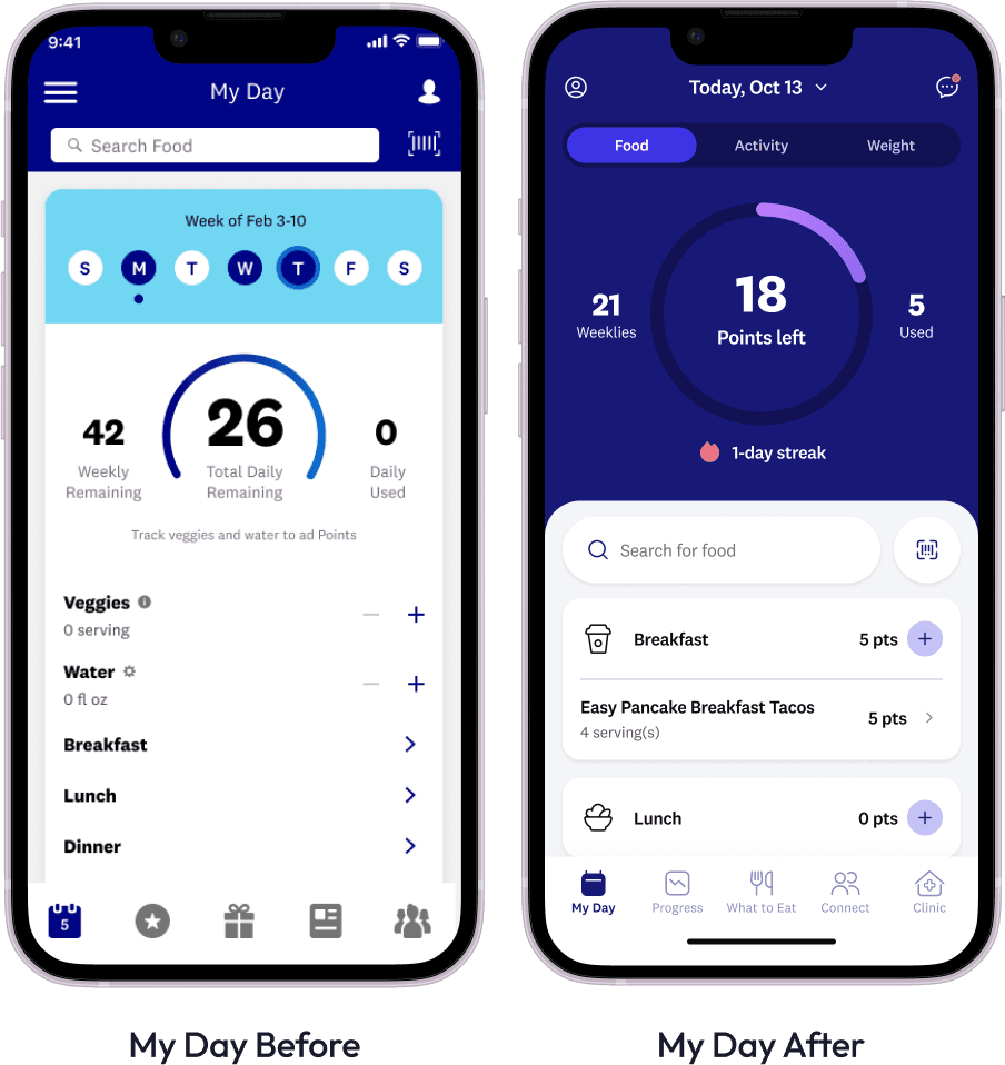
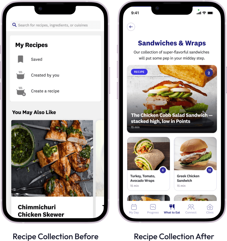
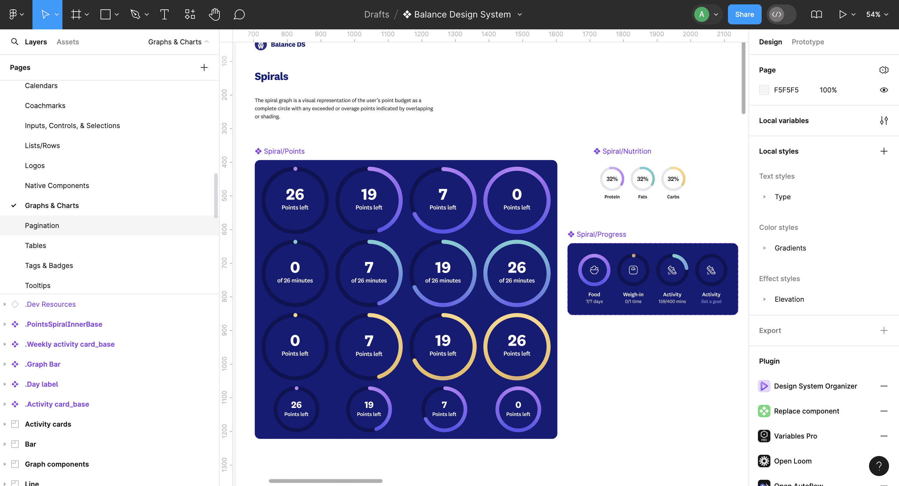
The design team divided the task of creating reusable components and implementing the new design, a process we referred to as “blurplifying.” We focused on developing flexible UI elements with multiple variants to ensure consistency across the app. This approach required meticulous attention to detail and collaboration to standardize component usage and maintain design integrity.
Testing
We conducted extensive user testing throughout the design and development phases. This involved gathering feedback on the updated UI and overall user experience to ensure that the changes were effective and well-received. We also prepared for potential user backlash by proactively communicating upcoming changes and providing support resources.
Implementation
With the design system finalized, we worked closely with the engineering team to build and integrate the new components. This phase included rigorous internal and stress testing to validate the functionality and performance of each component. Ensuring that the components worked seamlessly across different devices and scenarios was a critical aspect of this phase.
Launch
After six months of dedicated work, we launched the redesigned app in February 2024. The launch marked the culmination of our efforts and was met with positive feedback from users. The new design system not only improved the app’s user experience but also streamlined our design and development processes, allowing for faster implementation of future updates.
Lessons Learned
This project underscored the profound impact that a well-implemented design system can have on both user experience and operational efficiency. While I had previously understood the theoretical benefits of a design system, working on this large-scale implementation provided practical insights into its value. The design system enabled us to rapidly develop and deploy consistent, high-quality user experiences, significantly enhancing our ability to respond to user needs and market demands.
The experience also highlighted the importance of cross-functional collaboration and effective communication in managing complex projects. The success of the WW Balance Design System is a testament to the dedication and teamwork of all involved, and it serves as a model for future design and development initiatives.
Balance Design System - WeightWatchers
Design System Implementation
In 2013, the WeightWatchers (WW) app was designed as a companion for in-person workshops, primarily serving as a tool for members to track their food and points. However, when workshops transitioned to a virtual format due to the pandemic, the WW app became the central platform for the program. This shift led to a rapid influx of new features, which, combined with a lack of cohesive design and architectural planning, resulted in an overwhelming and confusing user experience. We built a comprehensive design system to address this which launched globally in February 2024. This initiative resulted in a notable improvement in key metrics: a 2% increase in activation rates, a 3% rise in food tracking, and a 1.5% boost in login rates.
Role
Product Designer
Company
WeightWatchers
Date
February 2024
Weight loss can be challenging and discouraging. Our goal was to transform the app experience into one that brings joy and support to our members, rather than adding to their frustration. It was clear that the app’s complexity and inconsistent design were problematic, not only for users but also for our tech team. Designers and engineers were repeatedly creating similar components, leading to inconsistencies and inefficiencies.
The Problem
Complexity and Overwhelm: The app became cluttered and difficult to navigate due to a rapid influx of new features without a cohesive design strategy.
Inconsistency: The lack of a unified design approach led to inconsistencies in the app’s user interface and experience, causing frustration for users.
Inefficiencies: Internal teams, including designers and engineers, faced inefficiencies due to repetitive work on similar components, which further contributed to the app’s inconsistencies and slowed down development.
Scope & constraints
This project was a significant undertaking that required extensive collaboration among design, product, and engineering teams. Managing numerous moving parts and ensuring consistent communication and expectation-setting across the organization were crucial challenges we faced.
Results
I advocated for and helped develop the WW Balance Design System, which launched globally in February 2024. This initiative resulted in a notable improvement in key metrics: a 2% increase in activation rates, a 3% rise in food tracking, and a 1.5% boost in login rates. These improvements reflect a more engaging and user-friendly experience for our members. Feedback from our users has been overwhelmingly positive. One member remarked, “The new app is beautiful. I love the look and ease of flow to find things. They have really upped their game at WW!”
Solution
Discovery
The project began with a thorough audit of the existing app screens. We documented and analyzed common patterns, components, and user flows to identify areas in need of improvement. This inventory provided a clear understanding of the current design landscape and helped us identify inconsistencies.
Design
Working closely with the brand and marketing teams, we envisioned a refreshed look and feel for the app. This process involved brainstorming sessions, mood boards, and multiple design iterations. Our goal was to align the app’s visual and functional aspects with the updated branding and marketing campaigns. After evaluating several design directions, the team selected a final approach that balanced aesthetics with usability.
Component Creation
The design team divided the task of creating reusable components and implementing the new design, a process we referred to as “blurplifying.” We focused on developing flexible UI elements with multiple variants to ensure consistency across the app. This approach required meticulous attention to detail and collaboration to standardize component usage and maintain design integrity.
Testing
We conducted extensive user testing throughout the design and development phases. This involved gathering feedback on the updated UI and overall user experience to ensure that the changes were effective and well-received. We also prepared for potential user backlash by proactively communicating upcoming changes and providing support resources.
Implementation
With the design system finalized, we worked closely with the engineering team to build and integrate the new components. This phase included rigorous internal and stress testing to validate the functionality and performance of each component. Ensuring that the components worked seamlessly across different devices and scenarios was a critical aspect of this phase.
Launch
After six months of dedicated work, we launched the redesigned app in February 2024. The launch marked the culmination of our efforts and was met with positive feedback from users. The new design system not only improved the app’s user experience but also streamlined our design and development processes, allowing for faster implementation of future updates.
Lessons Learned
This project underscored the profound impact that a well-implemented design system can have on both user experience and operational efficiency. While I had previously understood the theoretical benefits of a design system, working on this large-scale implementation provided practical insights into its value. The design system enabled us to rapidly develop and deploy consistent, high-quality user experiences, significantly enhancing our ability to respond to user needs and market demands.
The experience also highlighted the importance of cross-functional collaboration and effective communication in managing complex projects. The success of the WW Balance Design System is a testament to the dedication and teamwork of all involved, and it serves as a model for future design and development initiatives.
Balance Design System - WeightWatchers
Balance Design System - WeightWatchers
Design System Implementation
Design System Implementation
In 2013, the WeightWatchers (WW) app was designed as a companion for in-person workshops, primarily serving as a tool for members to track their food and points. However, when workshops transitioned to a virtual format due to the pandemic, the WW app became the central platform for the program. This shift led to a rapid influx of new features, which, combined with a lack of cohesive design and architectural planning, resulted in an overwhelming and confusing user experience. We built a comprehensive design system to address this which launched globally in February 2024. This initiative resulted in a notable improvement in key metrics: a 2% increase in activation rates, a 3% rise in food tracking, and a 1.5% boost in login rates.
In 2013, the WeightWatchers (WW) app was designed as a companion for in-person workshops, primarily serving as a tool for members to track their food and points. However, when workshops transitioned to a virtual format due to the pandemic, the WW app became the central platform for the program. This shift led to a rapid influx of new features, which, combined with a lack of cohesive design and architectural planning, resulted in an overwhelming and confusing user experience. We built a comprehensive design system to address this which launched globally in February 2024. This initiative resulted in a notable improvement in key metrics: a 2% increase in activation rates, a 3% rise in food tracking, and a 1.5% boost in login rates.
Role
Product Designer
Company
WeightWatchers
Date
February 2024