Storybook Retention Redesign
Storybook Retention Redesign
Gamification & Content Discovery
To increase retention, I redesigned the Storybook app to improve content discovery and integrate gamification, delight, and personalization. This was a 6-week client project.
To increase retention, I redesigned the Storybook app to improve content discovery and integrate gamification, delight, and personalization. This was a 6-week client project.
Role
Product Designer
Company
Freelance
Date
April 2021
Storybook is a story and massage app for parents to use with their children at bedtime. Their core value proposition is that massage can help relax your child and get them ready for bed. Their primary market is Latin America, but are looking to expand to the US. Storybook is having problems with user retention and wanted help in finding ways to improve their overall app experience.
The Problem
Storybook is struggling to retain their user base and convince users to pay for their app. How might we help users understand the value and the why behind Storybook to keep them coming back every night. We need to make Storybook a necessary addition to the bedtime routine.
Scope & constraints
Initially, my client hired me to just do a heuristic evaluation of their app. Once that was completed, I had so many ideas about what they may change to improve their user experience, they hired me to engage in a complete app redesign.
Constraints included limited timeline and outsourcing an engineering team that I would not be able to communicate with as I designed.
Results
Within 6 weeks, I delivered a completely redesigned app including user research and iterations. Storybook has reported a 47% increase in retention, and a huge lift in new sign-ups since implementing my design. The app has since won numerous awards and has recently been featured on Apple's App Store.
Solution
Heuristic Evaluation
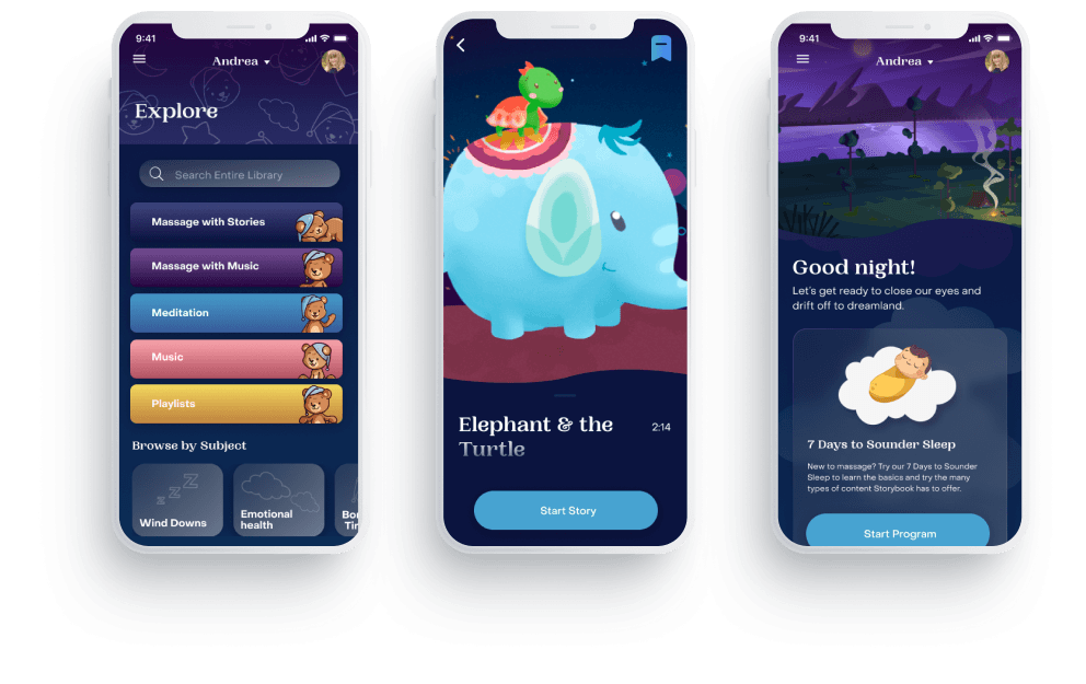
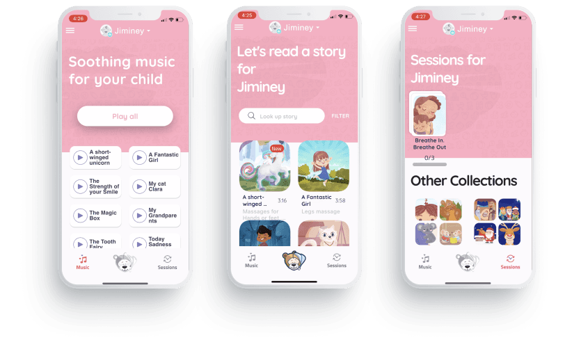
I started by taking a look at Storybook's current app and making notes on any usability issues that jump out. Their onboarding was pretty standard, but did ask a lot of personal questions about your child with no explanation as to why. The main navigation includes a place for music, stories, and a personalized experience called Sessions. The main issues I could see here were the bottom navigation wasn't very intuitive. The center bear icon doesn't have a label like the other nav items, so it's unclear what it is actually pointing to. Sessions didn't have any explanation about what it was or what you can do with it.
User Research Methologies
We needed to talk with users to gather valuable user insight about what they thought of Storybook. We talked to 7 users who fit the Storybook persona and asked them to download Storybook and test it for one week with their child. I spent 1 hour interviewing each participant about their experience using the app as well as their child's sleep habits and current bedtime routine.
I took notes from the interviews and sorted them into an affinity map. I color-coded the notes to mean green for good feedback, red for negative feedback, and blue for neutral so you can easily scan to see what is working and what is not. Grouping similar notes together, I was able to identify common insights from our users.
From our research, we came back with 4 big take-aways:
1. Users noted that the experience of using the app can be too stimulating. The stories can bring up complicated questions that aren't bedtime appropriate or can stimulate the imagination too much. The massage can also be tickle.
2. The experience doesn't feel personalized or tailored. Most of our users tried the same content - the content at the top. As they used the product, they wanted to find content more appropriate as they learned what worked and didn't.
3. Help mom know it's working to continue investing time. Users were not sure if it worked. They thought maybe, but then they weren't sure, so when free trial is up, they're not sure they need to pay for Storybook to get the benefit.
4. Center mom's experience. The person most impacted by sleep issues is mom. How might Storybook help her reclaim her time by investing a bit more during the sleep routine?
C+C Analysis
I pulled together a list of similar content heavy app to see how they organize content and present it to users. I noticed that many apps use a category headline for each block of content to help organize. I also looked at how habit building apps get users to come back by using badges and achievements to mark streaks and other important milestones.
Ideating
After doing a bit of exploring, we were able to come up with some feature ideas. I started by sketching out my ideas to quickly get my thoughts out and then turned those ideas into low-fi wireframes
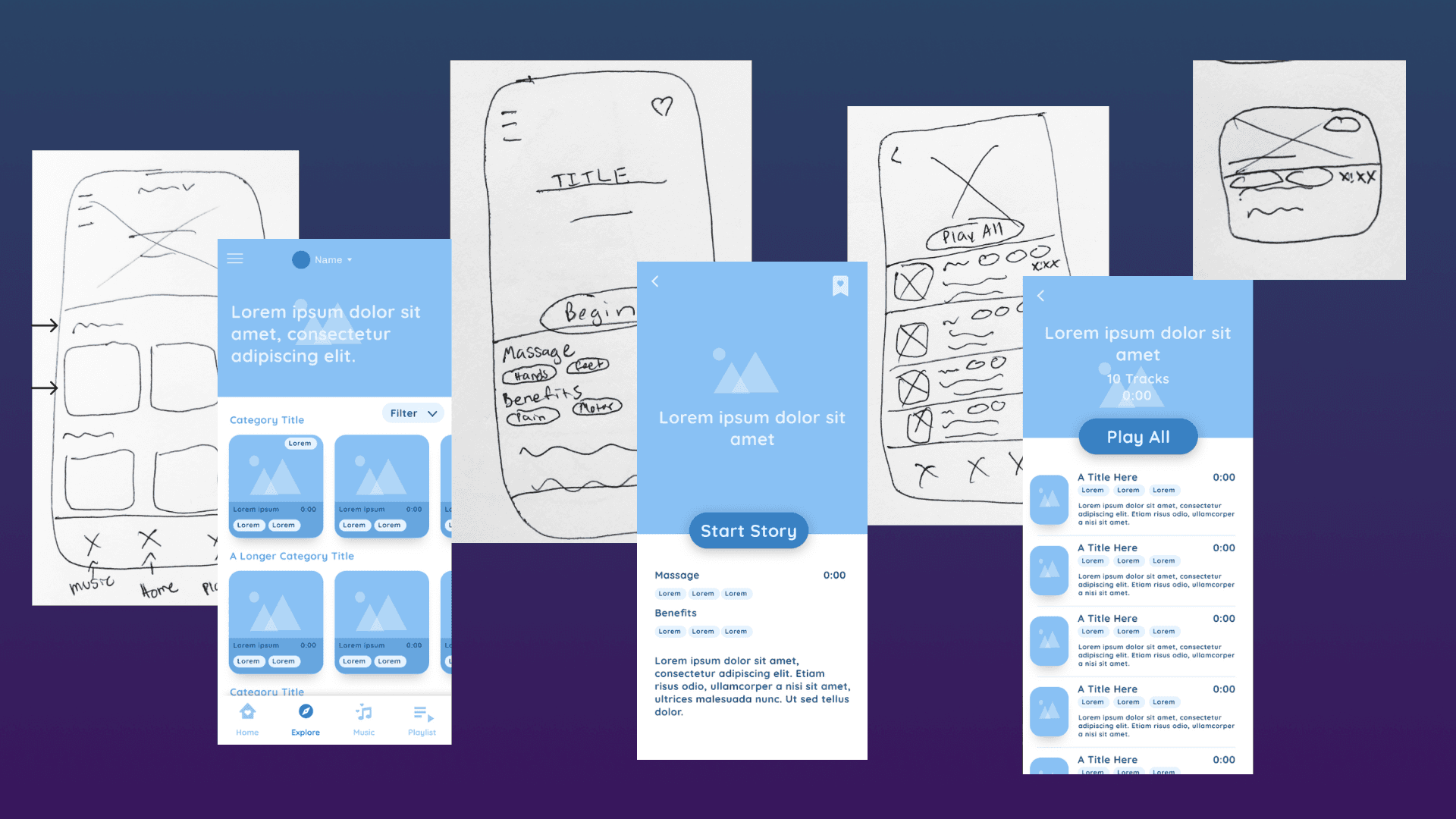
Iterations
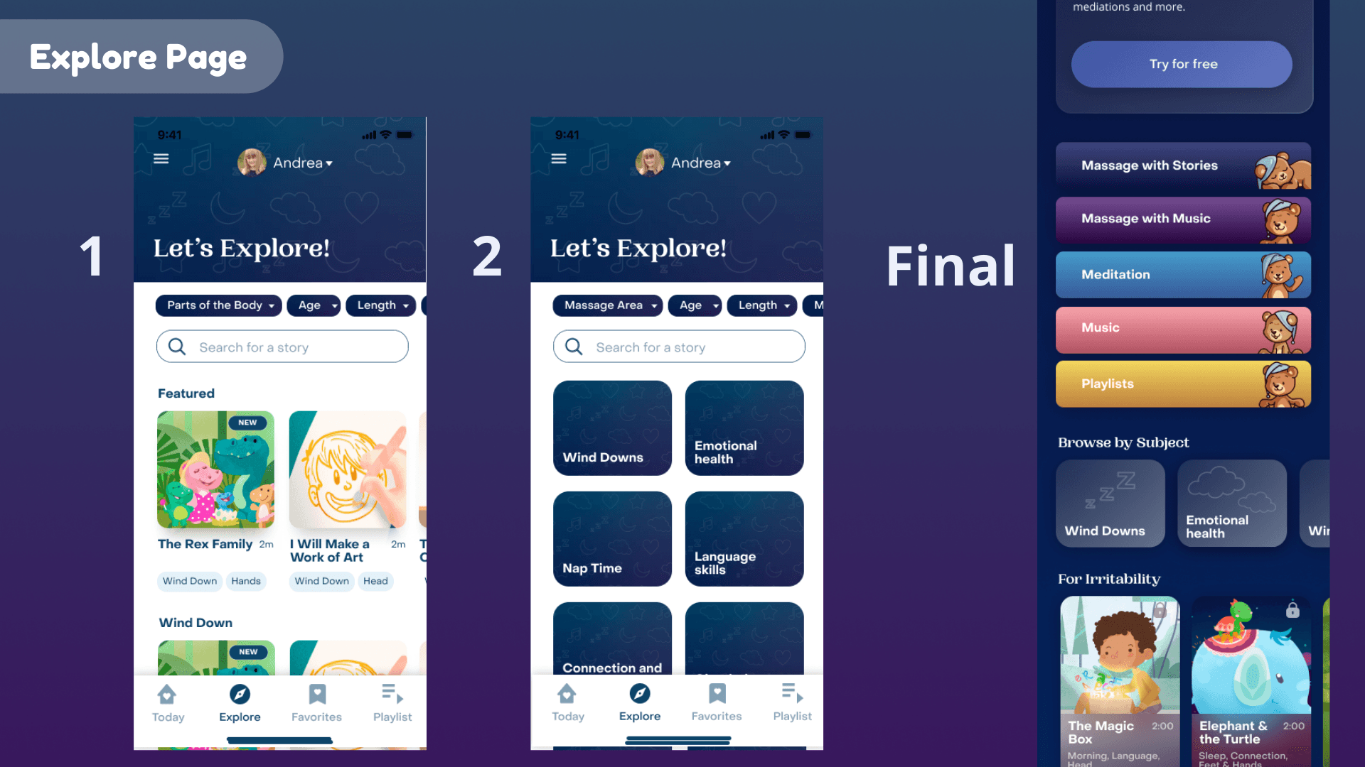
Starting with how to organize content. Users were having difficulties finding stories appropriate for the time of day. I started by creating scrollable cards organized with category titles. However, this didn't solve the problem of making it less distracting for kids. Kids can still see all the stories and pick based on pictures, even if it wasn't appropriate for that time.
I revised and sorted content into groups that parents will have to tap into before their child can pick. This way, the content is already filtered to what they are looking for. However, there wasn't a great way to only see massages or only see music.
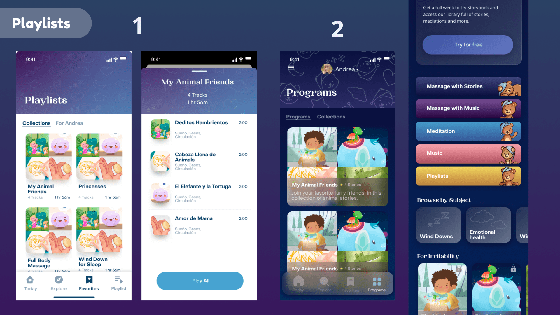
My final solution before testing with users is to have 2 ways for moms to filter before letting their child pick a story. They can filter by what they want - massage, music, meditation or they can browse by subject like wind downs, stories for emotional health and so on. Once inside a grouping, users can filter further to see exactly the content they want to see.
In our interviews, users expressed their desire for a more personalized experience. Why ask all those questions during onboarding to be given a generic list of stories? Storybook had thought about this and had a feature called "collections". Collections was never truly fleshed out and users rarely used it, let alone knew it existed. The word "collection" didn't seem personalized at all, "program" is much more indicative of the purpose of the feature.
Another user problem I wanted to solve was helping first time users see the value in Storybook and guide them through their first couple of tries. Using a program to start the user on a journey would encourage daily use of the app to complete the program. I pulled programs into its own home tab and have a large program CTA on the today screen to call attention to this important feature.

Playlists were a missing feature that would allow users to play long sets of content - solving the distraction problem created when a story ends.
In my first iteration, playlists were in the main nav. However, there wasn't a place for personalized programs. After going back and forth, we decided that programs made more sense to place in the main nav because it was such a departure of other content that it needed it's own home. so for now, playlists got moved to the explore screen as a category option.
We needed some way to bring delight to both the parent and the child and encourage them to keep coming back and trying new content. Based on strategies from other habit building apps, I decided to create badges you can earn as achievements. Another idea was to have children earn puzzle pieces as they complete stories that they can collect to build different puzzles. While I loved this idea and can see it's potential, we decided to table it because we wouldn't have the time to develop it properly and integrate it throughout the app.

User Testing
Testing assumptions is an important part of the design process. We put our prototype in front of 5 of the 7 participants who tested the original Storybook and asked them to complete a series of tasks unmoderated.
The feedback from these sessions were largely positive. Every user commented on the ease of navigation and how much of an improvement it makes. Users can now find what they are looking for and can filter options before their child chooses a story. Users also felt the experience was much more personalized and were excited to start a program to help their child with the issues they identified in the onboarding.
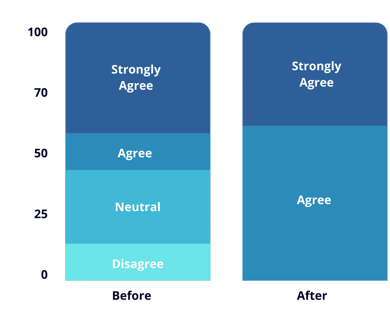
We asked users to fill out a survey after their first interview session with us. They were then asked to fill out a similar survey after their new Storybook testing session. When comparing answers to the same questions, you can see a huge improvement in the overall satisfaction of Storybook.
Live Experience
This is a screen recording of what is currently in production for the Storybook app as of August 2024.
Working on such a large project - basically an entire overhaul of the Storybook app - it was important to keep the Storybook team as involved as possible
I met with the Storybook team once a week to give them an update on where I am with the project and invited them to participate in design studios and shadow user interviews. I found that facilitating a collaborative relationship produced a product that was more authentic to the Storybook brand and team.
The importance of conveying the "why" behind an app pushing for behavior change
I was initially surprised at how often users expressed their want for a "why" behind massage and stories. In hindsight, it makes sense, but my first thoughts were a simple storytime app shouldn't need much explanation. I'm glad I discovered this insight as it was helpful in getting users what they need to change their behavior.
Storybook Retention Redesign
Gamification & Content Discovery
To increase retention, I redesigned the Storybook app to improve content discovery and integrate gamification, delight, and personalization. This was a 6-week client project.
Role
Product Designer
Company
Freelance
Date
April 2021
Storybook is a story and massage app for parents to use with their children at bedtime. Their core value proposition is that massage can help relax your child and get them ready for bed. Their primary market is Latin America, but are looking to expand to the US. Storybook is having problems with user retention and wanted help in finding ways to improve their overall app experience.
The Problem
Storybook is struggling to retain their user base and convince users to pay for their app. How might we help users understand the value and the why behind Storybook to keep them coming back every night. We need to make Storybook a necessary addition to the bedtime routine.
Scope & constraints
Initially, my client hired me to just do a heuristic evaluation of their app. Once that was completed, I had so many ideas about what they may change to improve their user experience, they hired me to engage in a complete app redesign.
Constraints included limited timeline and outsourcing an engineering team that I would not be able to communicate with as I designed.
Results
Within 6 weeks, I delivered a completely redesigned app including user research and iterations. Storybook has reported a 47% increase in retention, and a huge lift in new sign-ups since implementing my design. The app has since won numerous awards and has recently been featured on Apple's App Store.
Solution
Heuristic Evaluation
I started by taking a look at Storybook's current app and making notes on any usability issues that jump out. Their onboarding was pretty standard, but did ask a lot of personal questions about your child with no explanation as to why. The main navigation includes a place for music, stories, and a personalized experience called Sessions. The main issues I could see here were the bottom navigation wasn't very intuitive. The center bear icon doesn't have a label like the other nav items, so it's unclear what it is actually pointing to. Sessions didn't have any explanation about what it was or what you can do with it.
User Research Methologies
We needed to talk with users to gather valuable user insight about what they thought of Storybook. We talked to 7 users who fit the Storybook persona and asked them to download Storybook and test it for one week with their child. I spent 1 hour interviewing each participant about their experience using the app as well as their child's sleep habits and current bedtime routine.
I took notes from the interviews and sorted them into an affinity map. I color-coded the notes to mean green for good feedback, red for negative feedback, and blue for neutral so you can easily scan to see what is working and what is not. Grouping similar notes together, I was able to identify common insights from our users.
From our research, we came back with 4 big take-aways:
1. Users noted that the experience of using the app can be too stimulating. The stories can bring up complicated questions that aren't bedtime appropriate or can stimulate the imagination too much. The massage can also be tickle.
2. The experience doesn't feel personalized or tailored. Most of our users tried the same content - the content at the top. As they used the product, they wanted to find content more appropriate as they learned what worked and didn't.
3. Help mom know it's working to continue investing time. Users were not sure if it worked. They thought maybe, but then they weren't sure, so when free trial is up, they're not sure they need to pay for Storybook to get the benefit.
4. Center mom's experience. The person most impacted by sleep issues is mom. How might Storybook help her reclaim her time by investing a bit more during the sleep routine?
C+C Analysis
I pulled together a list of similar content heavy app to see how they organize content and present it to users. I noticed that many apps use a category headline for each block of content to help organize. I also looked at how habit building apps get users to come back by using badges and achievements to mark streaks and other important milestones.
Ideating
After doing a bit of exploring, we were able to come up with some feature ideas. I started by sketching out my ideas to quickly get my thoughts out and then turned those ideas into low-fi wireframes
User Testing
Testing assumptions is an important part of the design process. We put our prototype in front of 5 of the 7 participants who tested the original Storybook and asked them to complete a series of tasks unmoderated.
The feedback from these sessions were largely positive. Every user commented on the ease of navigation and how much of an improvement it makes. Users can now find what they are looking for and can filter options before their child chooses a story. Users also felt the experience was much more personalized and were excited to start a program to help their child with the issues they identified in the onboarding.
We asked users to fill out a survey after their first interview session with us. They were then asked to fill out a similar survey after their new Storybook testing session. When comparing answers to the same questions, you can see a huge improvement in the overall satisfaction of Storybook.
Live Experience
This is a screen recording of what is currently in production for the Storybook app as of August 2024.
We needed some way to bring delight to both the parent and the child and encourage them to keep coming back and trying new content. Based on strategies from other habit building apps, I decided to create badges you can earn as achievements. Another idea was to have children earn puzzle pieces as they complete stories that they can collect to build different puzzles. While I loved this idea and can see it's potential, we decided to table it because we wouldn't have the time to develop it properly and integrate it throughout the app.
Playlists were a missing feature that would allow users to play long sets of content - solving the distraction problem created when a story ends.
In my first iteration, playlists were in the main nav. However, there wasn't a place for personalized programs. After going back and forth, we decided that programs made more sense to place in the main nav because it was such a departure of other content that it needed it's own home. so for now, playlists got moved to the explore screen as a category option.
Iterations
Starting with how to organize content. Users were having difficulties finding stories appropriate for the time of day. I started by creating scrollable cards organized with category titles. However, this didn't solve the problem of making it less distracting for kids. Kids can still see all the stories and pick based on pictures, even if it wasn't appropriate for that time.
I revised and sorted content into groups that parents will have to tap into before their child can pick. This way, the content is already filtered to what they are looking for. However, there wasn't a great way to only see massages or only see music.
My final solution before testing with users is to have 2 ways for moms to filter before letting their child pick a story. They can filter by what they want - massage, music, meditation or they can browse by subject like wind downs, stories for emotional health and so on. Once inside a grouping, users can filter further to see exactly the content they want to see.
In our interviews, users expressed their desire for a more personalized experience. Why ask all those questions during onboarding to be given a generic list of stories? Storybook had thought about this and had a feature called "collections". Collections was never truly fleshed out and users rarely used it, let alone knew it existed. The word "collection" didn't seem personalized at all, "program" is much more indicative of the purpose of the feature.
Another user problem I wanted to solve was helping first time users see the value in Storybook and guide them through their first couple of tries. Using a program to start the user on a journey would encourage daily use of the app to complete the program. I pulled programs into its own home tab and have a large program CTA on the today screen to call attention to this important feature.
Working on such a large project - basically an entire overhaul of the Storybook app - it was important to keep the Storybook team as involved as possible
I met with the Storybook team once a week to give them an update on where I am with the project and invited them to participate in design studios and shadow user interviews. I found that facilitating a collaborative relationship produced a product that was more authentic to the Storybook brand and team.
The importance of conveying the "why" behind an app pushing for behavior change
I was initially surprised at how often users expressed their want for a "why" behind massage and stories. In hindsight, it makes sense, but my first thoughts were a simple storytime app shouldn't need much explanation. I'm glad I discovered this insight as it was helpful in getting users what they need to change their behavior.
Storybook Retention Redesign
Storybook Retention Redesign
Gamification & Content Discovery
Gamification & Content Discovery
To increase retention, I redesigned the Storybook app to improve content discovery and integrate gamification, delight, and personalization. This was a 6-week client project.
To increase retention, I redesigned the Storybook app to improve content discovery and integrate gamification, delight, and personalization. This was a 6-week client project.
Role
Product Designer
Company
Freelance
Date
April 2021